Analyse de données
Datavisualization
Data Visualization Challenge — Tourism in Occitanie ISTHIA Data Visualization Challenge Explore real tourism data from the Occitanie region and tell a compelling story through charts and visuals. 📍 Region: Occitanie,…
ISTHIA
Data Visualization
Challenge Explore real tourism data from the Occitanie region and tell a compelling story through charts and visuals. 📍 Region: Occitanie, France 📊 13 departments 🗂 11 data files 👥 Team project
What is Data Visualization?
Before diving in, watch this short introduction to understand the goals of this challenge. About the challenge
What is this challenge?
As part of this data analysis module, your team will explore a dataset and tell a story using charts — just as you would in a real professional data visualization competition. The goal is not to perform complex statistical calculations, but to communicate clearly and make data understandable to any audience. The dataset describes tourism activity across the Occitanie region : overnight stays, visitor origins, accommodation capacities, cultural events, and weather conditions. It was originally assembled for the Hackaviz 2020 competition organized by the Toulouse DataViz association. 💡 Key principle: The best data visualization is not the most complex — it is the one that tells the most interesting and honest story. Focus on insight, design, and clarity.
Rules of the game
🛠 Tools Any tool is allowed: Excel, Tableau, Python, Canva, Power BI, Observable HQ…
📐 Format Your final output must be a PDF of max 2 A4 pages, or 3 screenshots if web-based.
📊 Data You must only use the provided datasets. Base maps are allowed; other external data are not.
🔗 Combine You are not required to use all files. One file alone can be enough for a great story.
📋 Credits List all tools used in your final deliverable.
🎨 Context Add the necessary captions and context to help any reader understand each chart.
Visual examples
What can a DataViz look like?
Here are a few chart types you could use with this dataset. These are examples of techniques — the story you tell is what matters most.
OVERNIGHT STAYS OVER TIME Jan Mar May Aug Oct Dec Hérault H.-Garonne
Line chart — Time series Ideal for showing how overnight stays evolve throughout the year and comparing departments.
CAPACITY BY DEPARTMENT MAX 09 11 12 34 30 31 66 65 48 46 Department number
Bar chart — Ranking & comparison Compare accommodation capacity or total visits across departments at a glance.
MAP — TOURISM INTENSITY Low High Overnight stays Hérault
Choropleth map Color each department by tourism intensity. Requires the .geojson file and a mapping tool (QGIS, Python, Tableau).
SANKEY — TOURIST FLOWS Île-de-France PACA Auvergne-Rh. International Hérault H.-Garonne Pyrénées-Or.
Sankey diagram — Flows & origins Show where tourists come from and which departments they visit. Advanced but very impactful.
CALENDAR HEATMAP J F M A M J J A S O N D Mon Wed Fri Sun Few stays Peak season Full year calendar — each cell = one day
Calendar heatmap Each cell = one day, colored by volume. Instantly reveals seasonal patterns and peak periods.
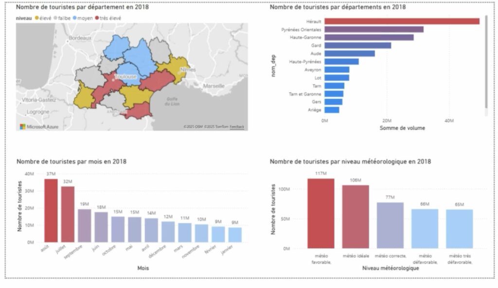 Real-world example A DataViz produced from this dataset — your work could look like this, or completely different. There is no single right answer.
Dataset overview
Real-world example A DataViz produced from this dataset — your work could look like this, or completely different. There is no single right answer.
Dataset overview
The Data Files
The dataset consists of three main data files (available in both CSV and Excel formats) and four reference files that help decode codes and add contextual information. Below is a detailed description of each file, with visualization ideas from beginner to advanced. Beginner idea Intermediate idea Advanced idea 📅 nuitees.csv & nuitees.xlsx Main file — Daily overnight stays per department · Recommended starting point 365rows (one per day) 15columns 13departments
What this file contains
This is the simplest and most recommended file to start with. It gives the total number of overnight stays for each day, broken down by Occitanie department. Think of it as a calendar showing how busy each area was, day by day. Overnight stay volumes were estimated from mobile phone data provided by a telephone operator and the Regional Tourism Committee (CRT). They are statistical estimates, not exact counts.
Columns
date dpt_09 (Ariège) dpt_11 (Aude) dpt_12 (Aveyron) dpt_30 (Gard) dpt_31 (Haute-Garonne) dpt_32 (Gers) dpt_34 (Hérault) dpt_46 (Lot) dpt_48 (Lozère) dpt_65 (Hautes-Pyrénées) dpt_66 (Pyrénées-Orientales) dpt_81 (Tarn) dpt_82 (Tarn-et-Garonne) total_occitanie
Visualization ideas — from simple to advanced
1
Total overnight stays per month — Group by month, sum total_occitanie. Instantly reveals the tourism season. Bar chart
2
Which department attracts the most visitors? — Sum each department column for the whole period and rank. Bar chart
3
Tourism trends over the year — Plot total_occitanie as a time series to see the rhythm of the full year. Line chart
4
Compare departments over time — Show multiple departments on the same chart — which areas peak together vs. at different times? Multi-line chart
5
Calendar heatmap — Color every day of the year by overnight stay volume. Beautiful and immediately readable seasonality. Calendar heatmap
6
Share of each department across the seasons — Show how the proportion of visits per department shifts throughout the year. Stacked area chart
Download: ⬇ nuitees.csv ⬇ nuitees.xlsx
🌍
par_origines.csv & par_origines.xlsx
Detailed file — Overnight stays broken down by origin, destination, weather & events
532K+rows
8columns
What this file contains
This is the most detailed file in the dataset. Each row represents a unique combination of date + origin + destination, giving you the volume of overnight stays for tourists from a specific French department or foreign country, visiting a specific Occitanie department, on a specific day. It also includes contextual variables : school holidays in the origin region, temperature and weather quality at the destination, and the number of major events active that day. ⚠️ Heads up: This file has over 500,000 rows. Excel may be slow — consider using Python/Pandas or Google Colab for analysis.
Columns
date org — origin (dept. or country code) dest — destination dept. in Occitanie volume — overnight stays vacances_org — school holidays (0/1/2) Temp_midi — noon temperature (°C) meteo — weather score (0–4) nb_evt — number of events that day
Decoding codes: The org column uses French department numbers (e.g., 31 = Haute-Garonne) and ISO country codes for foreign visitors (BE = Belgium, DE = Germany…). Use the Départements and Pays reference files to decode them.
meteo score: 0 = very unfavorable · 1 = unfavorable · 2 = correct · 3 = favorable · 4 = ideal
vacances_org : 0 = not on school holiday · 1 = on school holiday · 2 = not specified
Visualization ideas — from simple to advanced
1
Top 10 origins of tourists in Occitanie — Group by org, sum volume, and rank. Which French regions or countries send the most visitors? Bar chart
2
Domestic vs. international tourism — Split origins into French departments (numeric) vs. foreign countries (letter codes) and compare volumes. Pie chart
3
Does good weather bring more tourists? — Group rows by meteo score (0 to 4) and compare average overnight stays per category. Bar chart
4
Impact of school holidays on visits — Compare volumes during holiday periods (vacances_org = 1) vs. non-holiday periods. Grouped bar chart
5
Tourist flow mapping — Visualize where tourists come from and which department they visit with a flow diagram. Sankey / Chord diagram
6
Does temperature predict overnight stays? — Scatter plot of temperature vs. volume: does warmth attract visitors? Scatter plot
Download: ⬇ par_origines.csv ⬇ par_origines.xlsx
🏕
capacites.csv · capacites.xlsx · capacites.geojson
Accommodation capacity per department + weekly overnight stay totals
13rows (departments)
61columns
53weeks of data
What this file contains
This compact file combines two things: it tells you how many accommodation spots exist in each department (by type: hotels, camping, rentals, collective accommodation), and it also gives the weekly total of overnight stays (one column per week, weeks 1 to 53). With only 13 rows, it is easy to work with in Excel, and it allows you to compare supply vs. demand — a key question in hospitality management. The .geojson version adds geographic boundary data, allowing maps with QGIS, Python (GeoPandas/Folium), or d3.js.
Key columns
dpt — department number nom_dpt — department name pop_dpt — population Hbgt_collectif — collective accommodation (spots) Hbgt_locatif — rental accommodation (spots) Hbgt_plein_air — outdoor/camping (spots) Hbgt_hotel — hotel (spots) Hbgt_total — total accommodation spots sem_01 → sem_53 — overnight stays per week
Visualization ideas — from simple to advanced
1 Accommodation capacity by department — Compare total spots per department, broken down by type. Stacked bar chart 2 What type of accommodation dominates? — Show the proportion of each type across all of Occitanie. Pie / Donut chart 3 Weekly overnight stays per department — Use the 53 weekly columns to trace how visits evolve through the year for each department. Line chart 4 Where is demand tightest relative to supply? — Compare the peak week of overnight stays against total accommodation capacity for each department. Scatter plot 5 Map of tourism intensity — Use the .geojson file to color each department by total overnight stays or by capacity. Choropleth map 6 Tourism saturation index — Divide weekly overnight stays by total accommodation capacity to find which departments are most "full" during peak season. Heatmap or Map Download: ⬇ capacites.csv ⬇ capacites.xlsx ⬇ capacites.geojson Reference & complement files
Supporting Files
These files do not contain tourism data themselves, but they are essential decoding keys for reading the main files. They also provide contextual information (events, weather) that can enrich your analysis. 📦 complements.xlsx All-in-one reference workbook — Events, departments & countries in a single file
What this file contains
This Excel workbook has three sheets , each matching one of the CSV reference files below. It is the most convenient way to access all lookup tables in one place:
- Événements — List of major cultural events with dates and host departments
- Départements — French department codes and names
- Pays — Country codes and names for international tourists
Use this file as a reference table to decode codes found in par_origines, and to cross-reference event dates with overnight stay volumes.
Download: ⬇ complements.xlsx
🗺
Departements.csv
Reference — French department numbers and names
What this file contains
A two-column lookup table linking department numbers (e.g., 31) to their official names (e.g., Haute-Garonne). The org column in par_origines uses these numeric codes for French domestic tourists.
Use this file to label your charts with readable names instead of raw numbers, making your visualizations accessible to any reader.
N° départementNom du département
Download: ⬇ Departements.csv
🎪
Evenement.csv
Reference — Major cultural events in Occitanie
What this file contains
A list of major cultural events (music festivals, sporting events, fairs…) that took place across Occitanie. For each event: name, host department, start date, and end date.
The nb_evt column in par_origines counts events active on a given day — this file tells you which events those were. Combining both helps you tell stories about how culture drives tourism.
N° Département Évènement Début Fin
💡 Idea: Pick one festival and use nuitees to compare overnight stays before, during, and after it in the host department. A simple before/after line chart can be very compelling.
Download: ⬇ Evenement.csv
🌐
Payes.csv
Reference — Country codes for international tourists
What this file contains
A two-column table matching ISO country codes (e.g., BE, DE, GB) to country names. In par_origines, whenever the org column contains letters, the tourists are coming from abroad — this file decodes those codes.
PaysNom Pays
Download: ⬇ Payes.csv
Beginner's guide
How to Get Started
STEP 1
Start with nuitees.csv
Open it in Excel. Only 365 rows. Create a simple line chart of total_occitanie over time. You'll immediately see the tourism season take shape.
STEP 2
Find your story
Ask a concrete question: "Which department is most visited in summer?" or "Does rain reduce tourism?" Your charts should answer that question clearly.
STEP 3
Add context
Use the reference files (events, weather) to explain peaks and drops. Label your charts clearly. A title that already states the conclusion is always more effective.
STEP 4
Design matters
Choose colors deliberately. Remove clutter. Every element in a chart should serve a purpose. A well-designed simple chart always beats a complex ugly one.
Assessment
Evaluation
Your work will be assessed through a written exam. Oral presentations may take place in class but are not formally graded — they are a way to share your work and receive feedback from your peers and instructor. The criteria below reflect what will be assessed: your ability to visualize data honestly, to communicate clearly, and to explain your analytical choices. 📊 Visualizations The chart makes the data clearer and easier to understand/5 Any viewer can understand it without prior explanation/5 Colors are used purposefully and support the message/5 Data is represented faithfully — no misleading scales or distortions/5 🗣 Presentation of work The subject is presented in an engaging, dynamic way/5 Presentation materials are carefully designed and polished/5 Answers to questions are clear and confident/5 The analytical process and choices are well explained/5 Remember: This challenge rewards creativity, honesty, and clarity — not statistical performance. If you attempted a complex analysis that didn't fully work, explain it at the end: what you wanted to do and how you approached it. Intellectual effort is part of the grade. Resources Tools & Inspiration ✨ Sources of Inspiration 🌟DataViz InspirationGallery of the world's best data visualizations 🗺From Data to VizDecision tree: which chart type fits your data? 📐DataViz ProjectChart type reference library with examples 🏆Awwwards — DataVizAward-winning web-based data visualizations 😱WTF VisualizationsWhat NOT to do — learn from bad examples 🌟DataViz IndexFrom static infographics to interactive data viz 🌟Data to ArtExploring the intersection of global data expertise and artistic storytelling. 🛠 Some Tools 📊TableauInteractive dashboards — free academic license ⚡Observable HQJavaScript-based notebook for web charts 🐍 Python & Libraries 🐍PythonThe language — download and get started 🐼PandasData manipulation and analysis 📈MatplotlibFoundational plotting library 🎨SeabornStatistical visualization, beautiful defaults 🗺FoliumInteractive maps in Python 🌍GeoPandasGeospatial data — for the .geojson file 😉 Some Tutorials 📓Google Colab & PandasPDF tutorial — download to get started 🗺Drawing a Map in PythonStep-by-step tutorial on this website 🌊Drawing a Sankey in PythonStep-by-step tutorial on this website Have fun! 🎉 Dataset originally published for Hackaviz 2020 by the Toulouse DataViz Association. Used with the permission of Alain Otteinheimer, President of Toulouse DataViz & Director of DataSens. Data provided by the Regional Tourism Committee of Occitanie (CRT) & a mobile phone operator. Overnight stay volumes are statistical estimates, not exact counts. Page adapted for L3 Tourism · Hospitality · Food Studies — Marketeur Expert